Sharesies investor portfolio
User interface design • User experience research • Microcopy and content
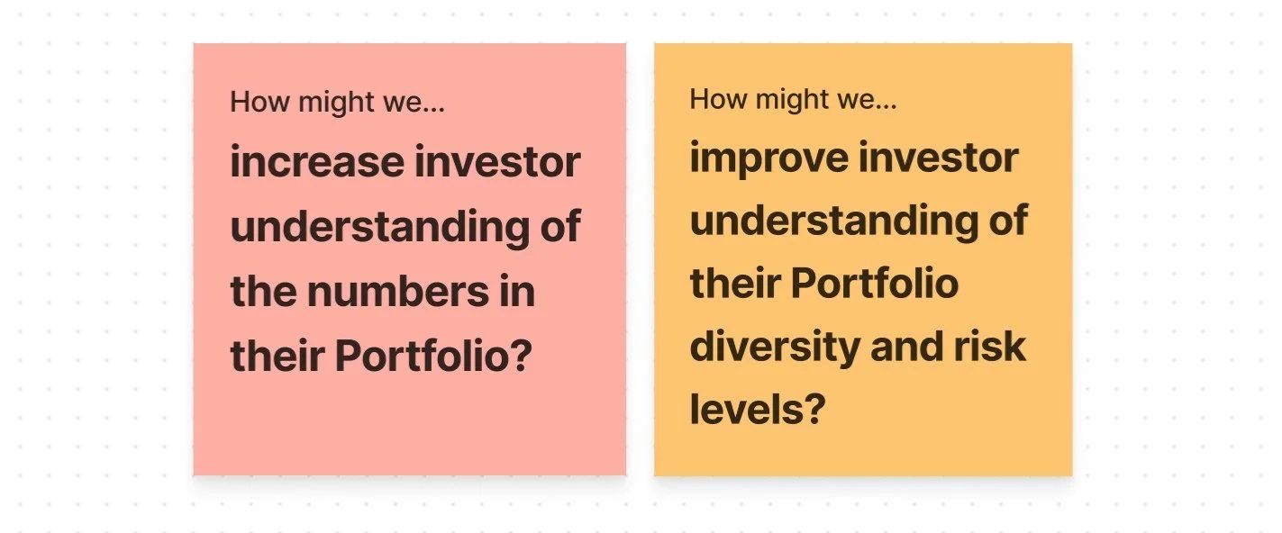
The portfolio page, before (left) and after (right).
For investors who use Sharesies to grow their wealth, the Portfolio page is the main place to see their investments, investing activity and to understand how their portfolio is tracking.
As the Sharesies offering expanded from 6 New Zealand based funds in 2018, to over 8,400 global investments today, the portfolio page needed to be revisited to make sure that it was still serving the needs of investors. Insights from the conversations that the customer care team were having with investors highlighted that:
the way investment returns were displayed was confusing
information that we prioritised about their portfolio wasn’t relevant to them
While investors on the Sharesies platform have varying levels of investing experience, it was important to focus on the needs of customers at the beginning of their investing journey.
We needed to avoid overwhelming investors by adding complexity, and make sure that we didn’t lose the friendly approachable feel that is core to the Sharesies brand.
Our process
Redesigning the Portfolio page was the combined efforts of our team’s Design Lead Jess MacDonald, working with Joyce Kim and myself. My contribution to the project included:
Creating online prototype tests and surveys
Analysing findings from testing results
Exploring and refining user interface options
Creating new design components
Drafting copy and working with our content designer Thomas Sutherland to clearly explain complex investing concepts
Working with the product owner and developers to write requirements for each phased release
Writing digital accessibility requirements such as ARIA labelling, alt text and HTML page structure
Our process included multiple rounds of prototype testing through online tool Maze, comparing the responses to design variations, then iterating and retesting.
To make sure that our designs met the needs of communities that have often been left behind when it comes to financial empowerment, it was important to us that we had representation from Māori and Pasifika customers in our testing groups, and had 50% of participants identify as women or gender diverse.


The new portfolio
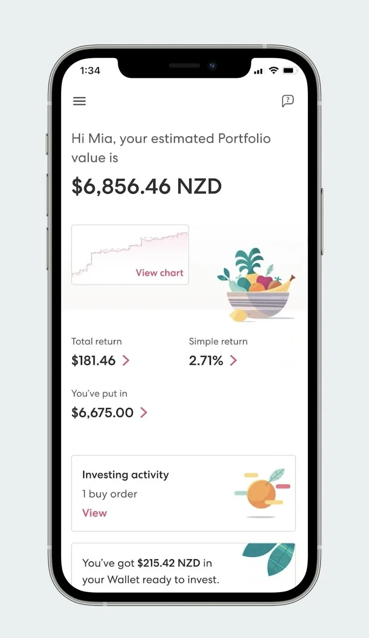
Based on customer feedback about what information was most important, we prioritised showing the overall portfolio value, total return amount and percentage return, with a clearer hierarchy that made the page easier to scan.
For each figure we showed, we added a breakdown that explained how each number was calculated, and included explanations of each term. More than 90% of customers (out of 295 survey participants) could correctly identify these numbers.
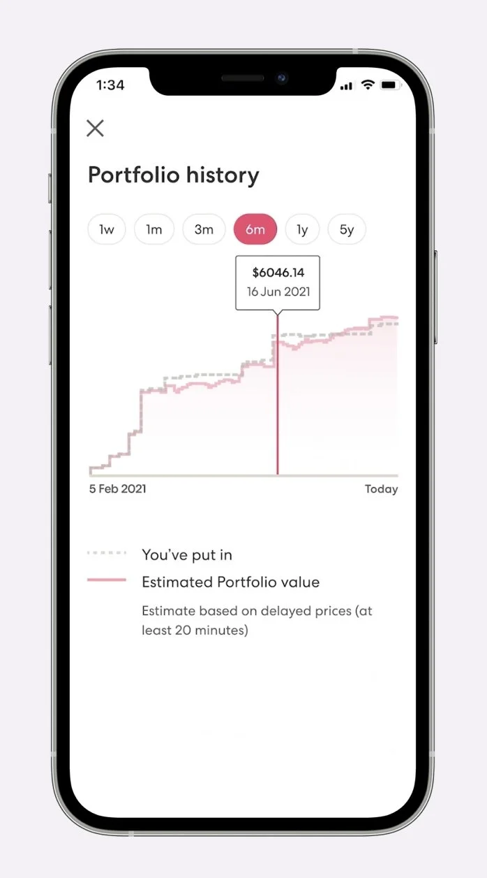
We knew from research that investors wanted to be able to keep track of recent and upcoming investing activity in a feed. While it was out of the scope of this project, we were able to bridge this in the short term with a component that displayed recent and pending buys and sells.
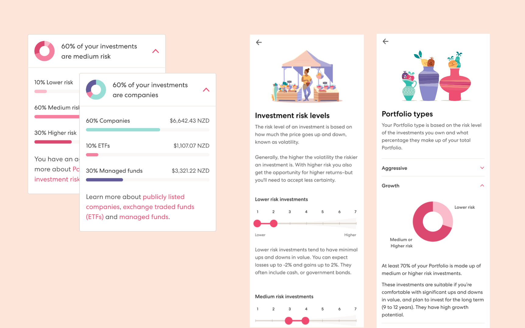
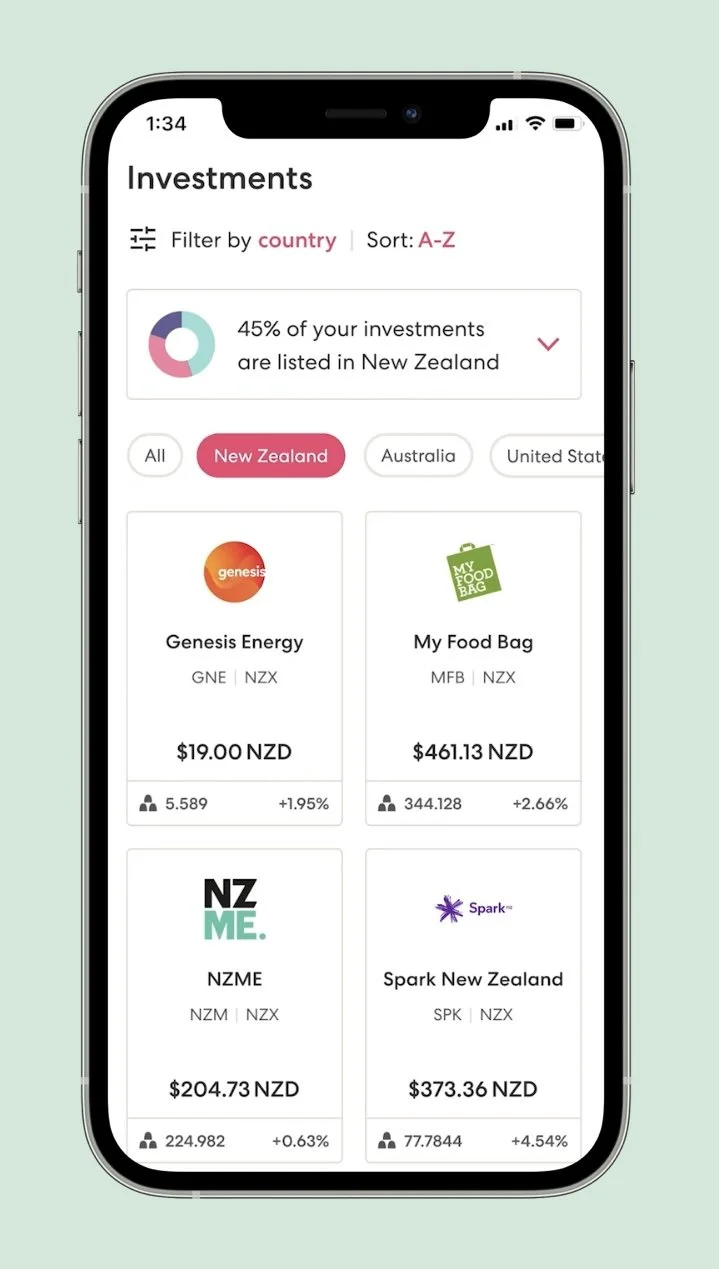
To help customers to understand their portfolio diversity, we added a new component that showed their portfolio make up by country, risk level and investment type. We showed this information as they interacted with the investment filters. This was designed to be able to accommodate additional filters in the future.
To make sure that we were empowering customers rather than overwhelming them with information, our approach was to layer educational content to allow them to learn and explore at their own pace.