Transaction details for Sharesies investors
When placing an order to buy or sell shares on Sharesies, there’s a chance that this happens across multiple transactions. This is caused by the market conditions (how many buyers and sellers are trading) and is more likely to happen if you’ve set a specific price to buy or sell at, or you’re buying or selling a larger number of shares.
As we added more investments to the Sharesies platform, and provided more controls for investors buying or selling shares, the frequency of orders filling over multiple transactions increased to 20% of sell orders and 10% of buy orders.
The goal of this project was to improve the experience for investors who have their buy or sell orders split into multiple trades.
The problem
The existing UI treated each transaction as a separate order, causing multiple entries to show in an investor’s wallet – most often two or three, but occasionally up to 20 transactions. Selecting one would open a carousel that allowed the investor to navigate between them that was often missed.
This experience for investors whose orders had been completed over multiple trades caused confusion, uncertainty and frustration.


The process
I worked on this project independently with input and feedback from designers in my team. The process included:
Finding situations where investors had been confused or frustrated by the current experience (searching through customer care conversations with investors)
Consulting with subject matter experts internally to understand industry standard and business requirements
Developing concepts and exploring new UI options
Conducting interviews with investors who had recently seen their order fill over multiple trades, and taking them through the proposed changes to the experience
Surveying a larger group to validate findings from qualitative interviews
Creating high fidelity designs and specifications
Initial research
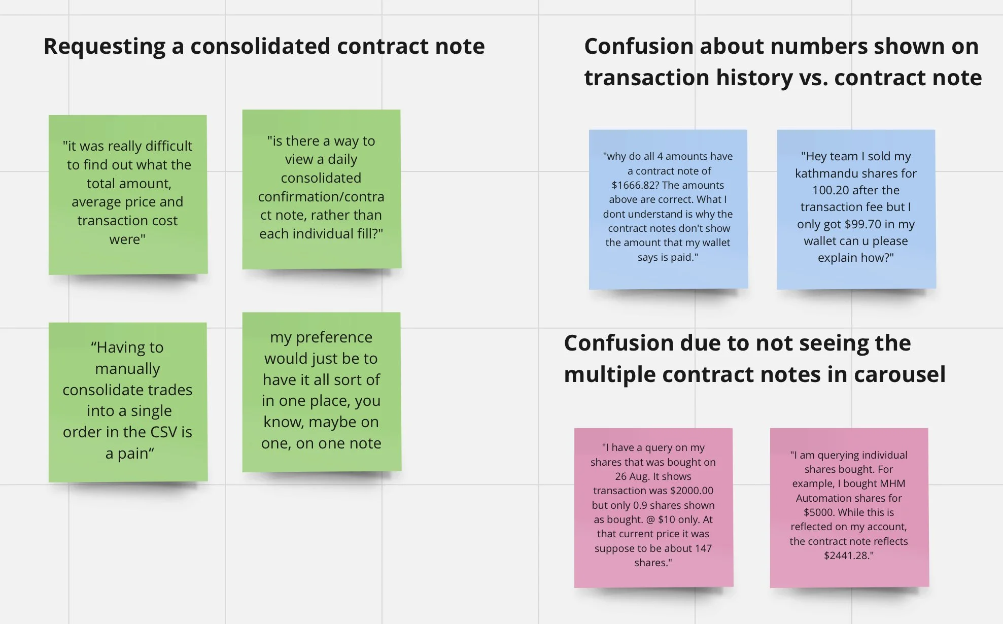
Conversations that the customer care team were having with investors showed that:
Some investors didn’t know that orders could fill bit-by-bit
Investors didn’t understand why that was happening, and were often worried about where their money had gone
It was hard to work out the transaction fees, the total amount they’d paid, and the average price they’d received or paid per share
It wasn’t clear what would happen if you canceled your order that had partially filled
Concepts
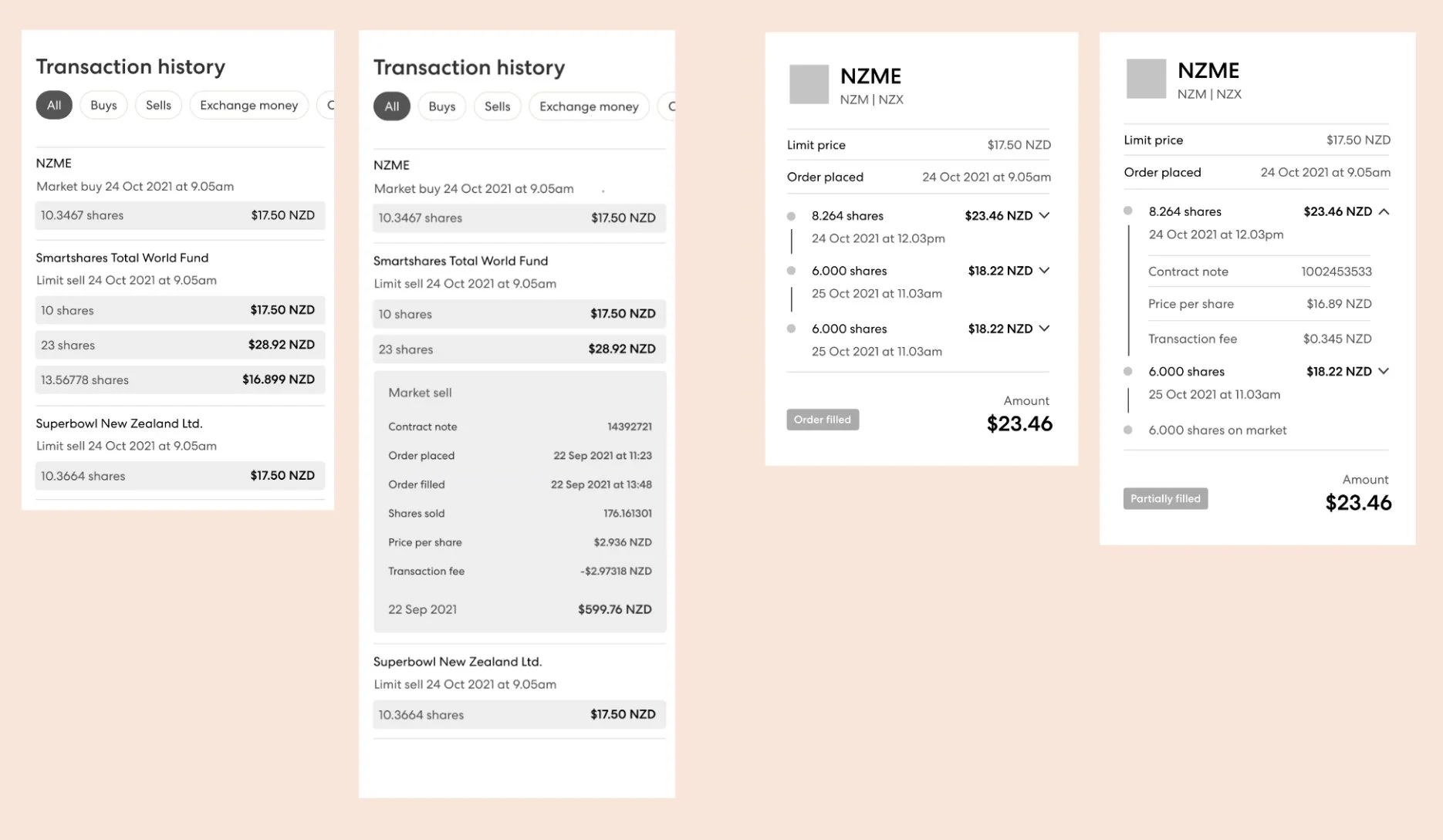
Based on this research, I created initial concepts to share with the team for feedback. Because of the increased technical effort involved we ruled out showing order details in the transaction history feed (left) and instead focused on testing a timeline concept in the ‘contract note’ or receipt (right).
We conducted three moderated online interviews with customers who had recently been in touch with our customer care team to ask about their orders that had been split into multiple transactions. We asked them about their experience, and had them to interact with our (very rough!) wireframe prototype. From these interviews, we found:
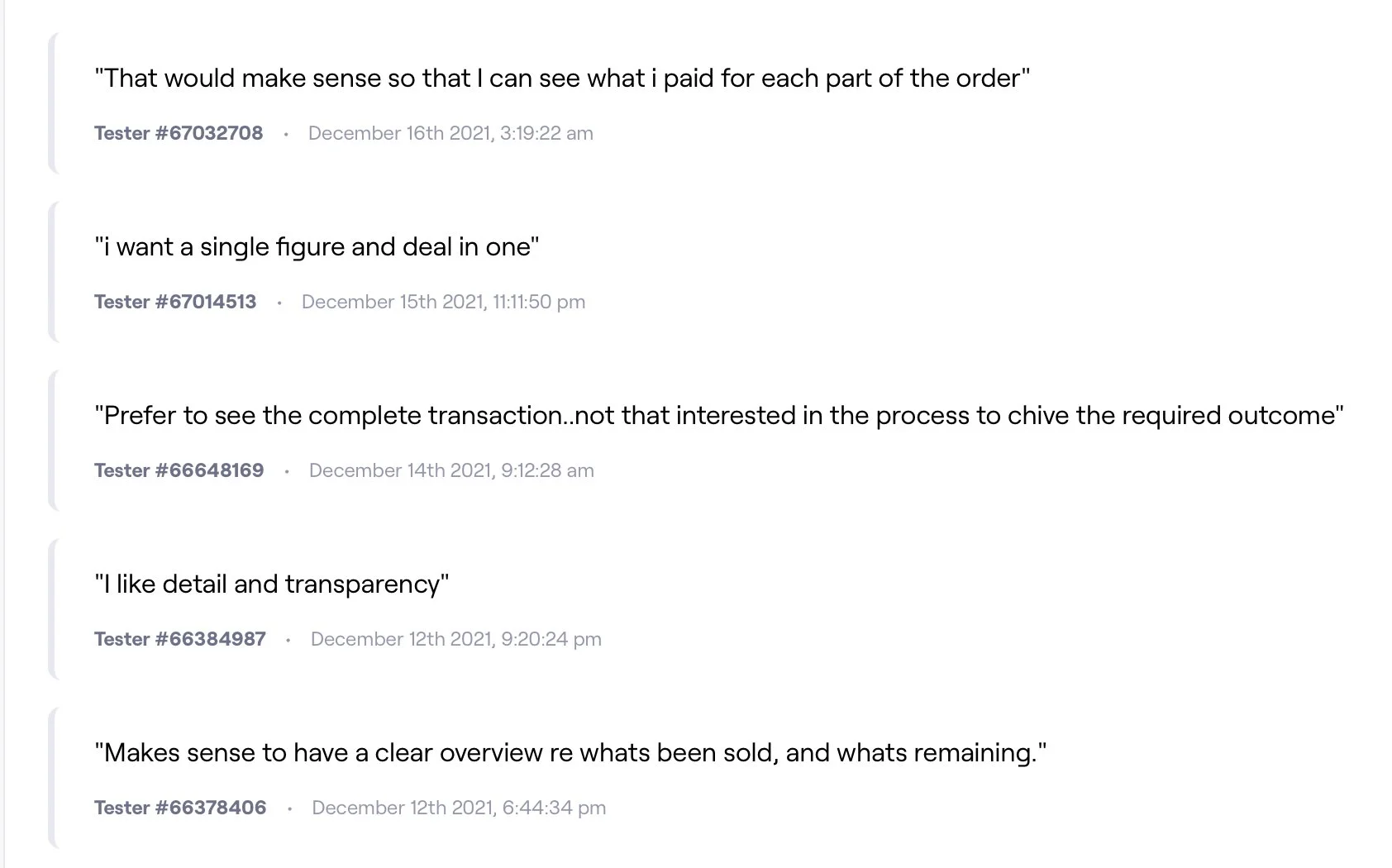
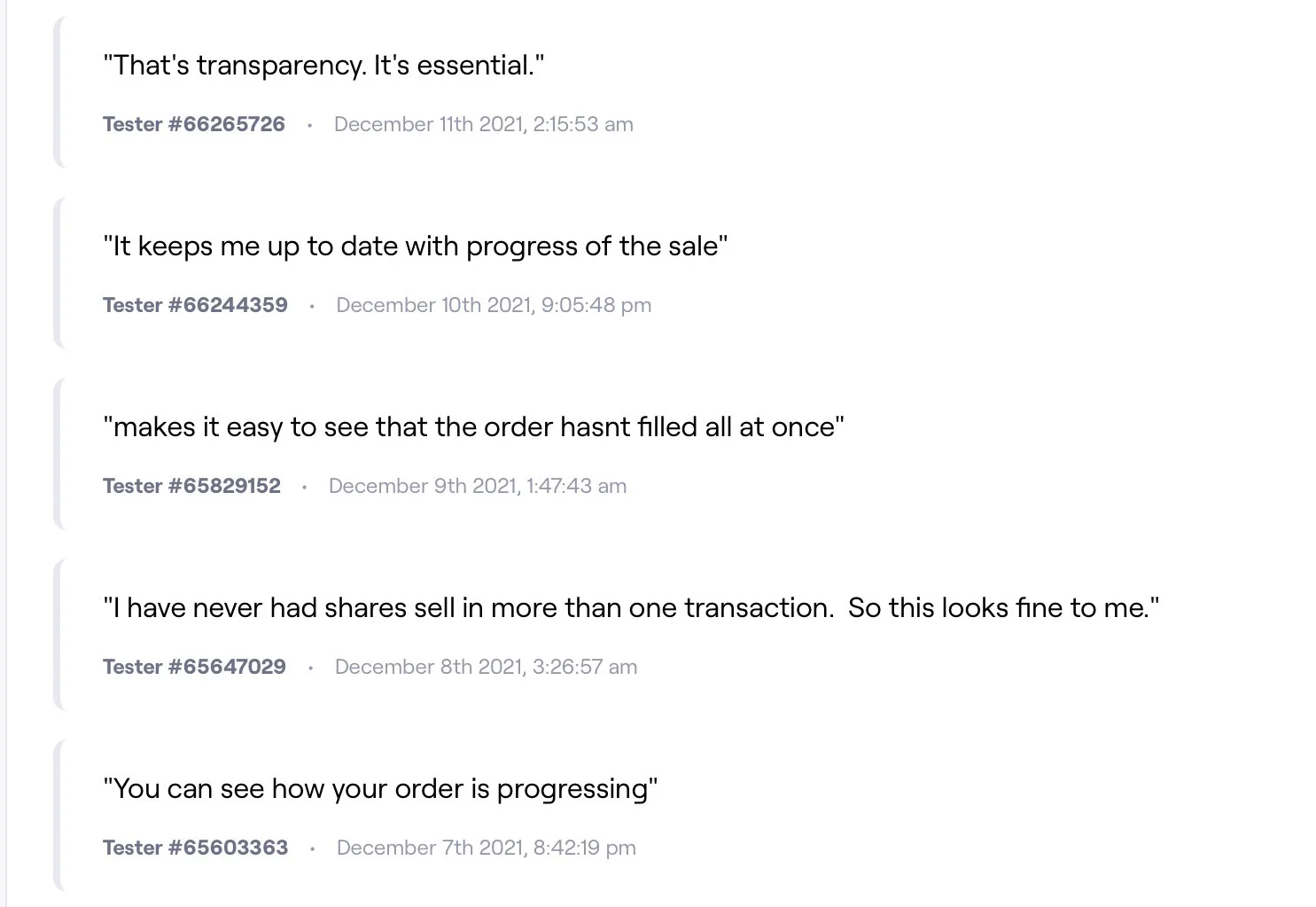
They were happy to have a summary contract note for their split orders
They all wanted to see the details for each trade that was part of their order, which included the price per share and fees
All participants understood that you could expand the trades to see more information
Seeing average price per share and total transaction fees was important
'Shares remaining' figure wasn't very prominent for a pretty important number
Total number of shares sold was important (wasn’t included in designs)
There was an opportunity for education around why an order would happen over multiple transactions

Based on the feedback from the customer interviews I then explored the timeline idea further and experimented with different UI patterns and microcopy. Quantitative research through a survey with over 45 participants helped to confirm the UI direction and gave ideas for further improvements.
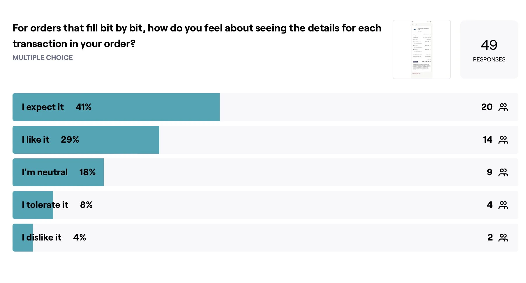
I used the Kano model to ask investors to evaluate their experience. The majority of investors appreciated the extra level of detail available for each of their transactions, and others were happy to just see the summary for their order. This gave the team confidence in our approach of showing the summary in the main view on the contract note, and showing extra detail for individual transactions in an expandable concertina.
The solution
To fit with the mental model that investors had that each contract note was a receipt for an order (rather than a receipt for a single transaction) I made the change to show all transactions on one contract note.
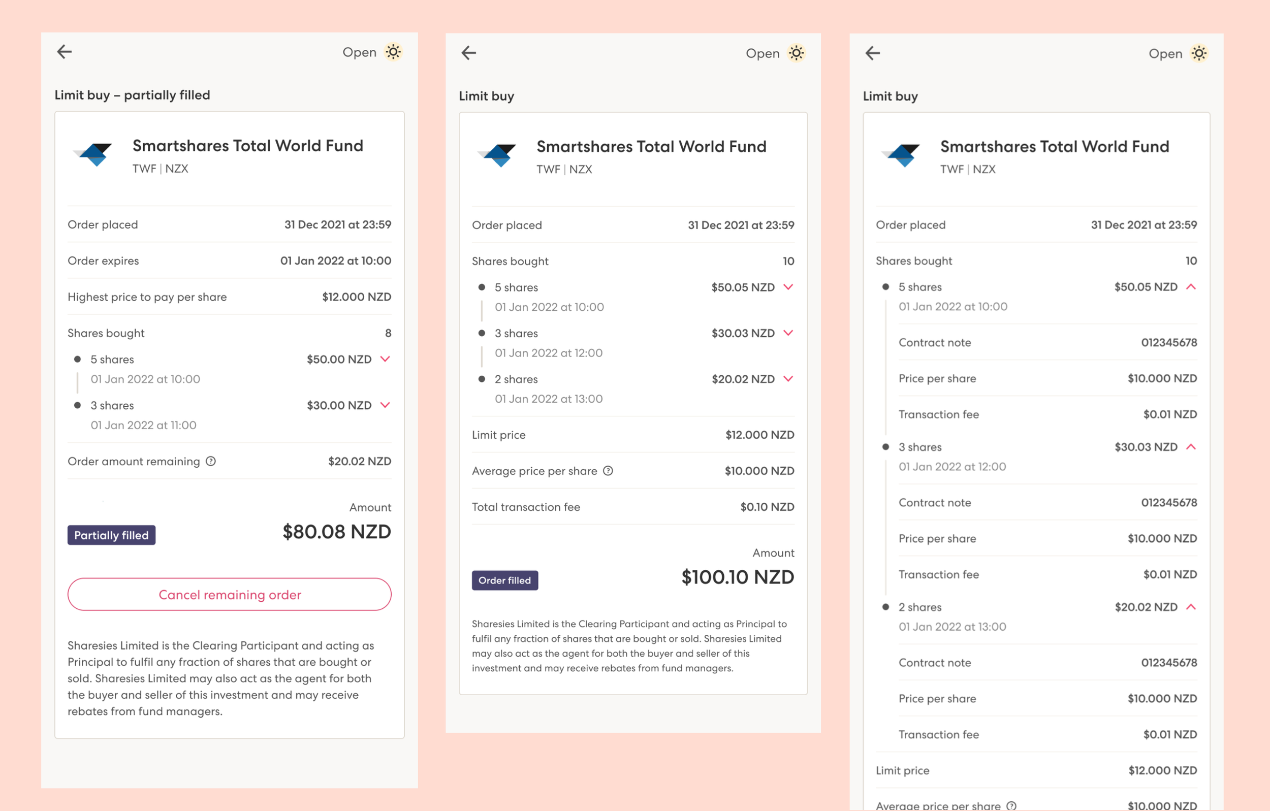
Each transaction appears chronologically in a timeline view that can be expanded to see the transaction fees and price per share. While an order is partially filled, investors can see how much of their order remains on the market. Once the entire order fills, investors can see a summary of their order, including the average price per share, and the total transaction fee they’ve paid.
There were a number of edge cases to consider, such as when the remaining part of an order would expire or be rejected. A partially filled order had the option of being cancelled, so we changed the language we used to make it clear that it only affected the remaining part of the order.
Investors can see their order update as transactions happen, which helps less experienced investors to learn and understand how the process of filling an order on an exchange works. New copy included on the transaction history feed and on the order details page gives a clearer indication of the status of their order, and makes it clearer when an order has partially filled.